
Artistic fashion tips: harmonizing color and art
, by Gary KAGO , 11 min reading time
, by Gary KAGO , 11 min reading time
Discover how to harmonize colors, patterns, and textures for a unique artistic style. Color rules, capsule wardrobe tips, and expert advice for young creatives.
TL;DR:
- The mastery of colours is based on the colour wheel and the 60-30-10 rule.
- Combining patterns and textures creates a bold yet harmonious style.
- Building a capsule wardrobe with neutrals and strong colors facilitates a coherent artistic expression.
Creating an artistic and colorful outfit without visual overload is a real challenge. Many young creatives feel this tension between the desire to express their individuality and the fear of making a color misstep. Yet, a few simple rules are all it takes to find this balance. In this article, you'll discover how to use the color wheel, combine patterns and textures, build a cohesive capsule wardrobe, and dare to be stylistically bold. Each section offers concrete criteria, practical tips, and comparisons to help you assert your identity through your clothing.
| Point | Details |
|---|---|
| Chromatic balance | Combining complementary or analogous colors guarantees artistic harmony without visual overload. |
| Patterns and morphology | Choosing a dominant pattern that suits your silhouette maximizes impact while remaining elegant. |
| Capsule wardrobe | A coherent palette and a few colorful touches allow you to express your creativity every day. |
| Controlled audacity | Color block techniques or monochrome textures create a strong style, without compromising on harmony. |
The color wheel is the essential tool for any creative person who wants to express their personality coherently. It organizes colors into three main groups of combinations, each producing a distinct visual effect.
The three main types of harmonies:
For harmonize the colors When it comes to outfits, there's a simple and effective rule of proportion: the 60-30-10 rule. Dedicate 60% of your outfit to a dominant color, 30% to a secondary color, and 10% to an accent color. This distribution creates a clear visual hierarchy without overwhelming the eye.
There chromatic rule It is recommended to limit each outfit to a maximum of three colors to avoid visual cacophony. Beyond that, the harmony is fragmented and the eye no longer knows where to rest.
Comparative table of color combinations:
| Combination | Visual effect | Difficulty level |
|---|---|---|
| Blue + orange | Strong contrast, dynamic | Intermediate |
| Green + yellow + yellow-green | Natural softness | Easy |
| All shades of burgundy | Understated elegance | Easy |
| Red + purple + pink | Artistic audacity | Advanced |
The connection between personality and colors is real. Each shade carries an emotion. Red evokes energy, blue serenity, yellow creativity.
Pro tip: Choose your dominant color based on your mood or the energy you want to project that day. This intuitive choice makes your outfit authentic.
After discussing color theory, let's delve into the patterns and textures that add depth to a look. A plain garment can be beautiful, but it's the pattern that tells a story.
The fundamental rule for combine the patterns Avoiding clutter is simple: choose a strong dominant pattern, then complement it with secondary patterns that share at least one common color. This logic creates a coherent visual flow.
Steps to successfully mix patterns:
Textures play just as important a role. A thick fabric like wool creates visual depth. Silk or satin bring lightness. Mixing different materials in the same outfit adds a tactile and artistic dimension that colors alone cannot provide. You can explore techniques, patterns and colors to further explore this approach.
"Adapting patterns to one's body shape allows one to enhance every style."
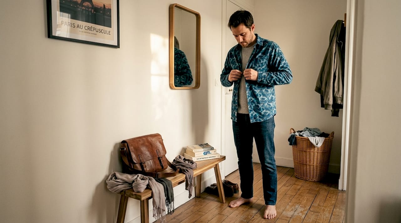
Pro tip: Vertical stripes visually lengthen the silhouette. If you're wearing a striped pattern, orient it vertically to slim your line, even on a colorful or graphic piece. For a simple base to style, a quality plain t-shirt is your best ally.
Once you've mastered patterns and textures, the next step is to build a cohesive, artistic, and adaptable wardrobe. The idea isn't to have few clothes. It's to have clothes that complement each other.
The foundation of a creative capsule wardrobe rests on solid neutrals: black, white, beige, and gray. These shades serve as a canvas, accommodating bold colors without overwhelming them. Start with neutrals Adding bold accents is the most effective way to build a cohesive style identity. Studies show that 85% of capsule wardrobe users report being more satisfied with their everyday outfit combinations.
Table of capsule palettes and their effects:
| Palette | Key colors | Result |
|---|---|---|
| Solar art | White + saffron yellow + terracotta | Warm, creative, energetic |
| Gentle urban | Grey + lavender + sage green | Balanced, modern, soothing |
| Intense Graphic | Black + bright red + cobalt | Strong, bold, memorable |
| Living Nature | Beige + forest green + ochre | Natural, authentic, organic |
L'impact of personal pallets The impact on mood and self-confidence is well-documented. Wearing intentionally chosen colors truly changes how you feel and how others perceive you.
Advantages of a colorful capsule wardrobe:
To find your harmonious paletteAlso, draw inspiration from works of art that you love. The colors that resonate with you in a painting are often those that reflect your own personality.
Pro tip: Choose two key colors that appear in several pieces of your wardrobe. This repetition creates strong visual coherence and makes your style instantly recognizable.
For those who want to explore their bold side, let's see how to work with artistic exception. Boldness doesn't mean chromatic anarchy. It actually requires more control than restraint.
Techniques for a bold and cohesive look:
THE colors too bright Excessive use creates a visual cacophony. The rule remains the same: limit saturated hues to a maximum of two per outfit. Color blocking works precisely because it structures these strong colors within lighter areas.
Color psychology confirms this link between bold clothing and self-confidence. Wearing bright red or yellow promotes a more assertive posture. This is not insignificant. Your outfit influences your state of mind as much as it reflects your personality. Complete your look with... bold accessories to amplify this effect without overloading the main outfit. One trendy hairstyle can also enhance the overall impact of your colorful style.
Pro tip: In monochrome, focus on textures to create movement. Corduroy trousers with a fine knit sweater, both in the same shade, produce a very sophisticated, artistic effect.
Color rules are tools, not constraints. We see it every day: the people who dress with the most impact don't follow trends to the letter. They interpret them.
Color and bold pattern mixing are powerful tools for young creatives who want to express their individuality. Bright colors signal an extroverted personality. Sophisticated monochrome evokes control and depth. Neither is superior. What matters is the coherence between what you wear and how you feel.
"Dare to make every choice; it's uniqueness that creates an unforgettable style."
OUR creative approach This principle is key. Theory guides you, but it's your experience that brings a look to life. Adapt each piece of advice to your own feelings. An authentic style isn't built by applying formulas. It's born when you trust your own vision.
Pro tip: Keep a photo of your favorite outfits. Analyze what makes them successful. You'll discover your own rules, more precise than any guide.
You now have the tools to create colorful, cohesive, and artistic outfits. The next step is to find the pieces that truly embody this vision.
There EST collection.L Shop brings together clothing and accessories designed for creatives who reject ordinary style. Each piece is conceived around personal expression, color, and graphic art. You will find there original drawings to wear or display, as well as a selection of artistic accessories to complete your looks with character. EST.L Shop supports your creative process with unique pieces that make a difference.
Start with neutral colors then add 2 to 3 strong colors that reflect your personality, following the 60-30-10 rule. This proportion guarantees effortless, natural visual harmony.
Choose a dominant pattern with colors that are shared with secondary patterns, and pair them with basic garments. This method minimizes the risk of clutter while maintaining a strong visual identity.
Stick to a limit of three colors per outfit and vary the textures or patterns for visual balance. If the outfit looks dull, add a single colorful accessory rather than using multiple shades.
Yes, studies show that bright colors boost creativity and confidence, blue is calming, while yellow is energizing. Choosing your colors intentionally transforms both how others see you and your own state of mind.


