
Reveal your style: the role of colors in fashion and art
, by Gary KAGO , 15 min reading time
, by Gary KAGO , 15 min reading time
Discover the role of colors in fashion: how they influence your impressions and reflect your style. Learn how to master them!
TL;DR:
- Colour influences 90% of the first impression of clothing.
- Psychology and culture give a precise emotional meaning to each shade.
- Colorimetry and the theory of seasons make it possible to harmonize each palette with its personal characteristics.
The color of a garment speaks volumes before you even open your mouth. Contrary to popular belief, it's not the cut or the brand that creates the first impression, but rather the chosen color palette. According to a study on impressions90% of impressions related to an outfit are influenced by color. This statistic challenges everything we think we know about fashion. In this article, we will explore why color is much more than an aesthetic preference: it's a language in its own right.
| Point | Details |
|---|---|
| Color influences perception | Colour accounts for 90% of the first impression in fashion, beyond the cut or the brand. |
| Methods for choosing | Colorimetry and draping testing help to refine one's ideal palette. |
| Emotional symbolism | Each color carries a message and reflects emotion or state of mind, to be adapted to express oneself. |
| Trends to watch for in 2026 | Soft pastels, bright tones and neutrals dominate fashion and art this year. |
| Expressing one's personality | Daring to mix and match allows you to assert a creative and unique style. |
Color acts in milliseconds. Before perceiving a silhouette, a fabric, or a pattern, the eye captures the hue. This process is almost automatic. It is rooted in human psychology and centuries of cultural codes.
Colors are not neutral. Each one carries a specific emotional charge. According to the symbolic psychology of colorsHere is what the main colors evoke:
These associations are not universal. In Asia, white is the color of mourning. In the West, it symbolizes purity and peace. Choosing a color for a specific event therefore requires at least a basic understanding of these cultural nuances.
“Color is the key; the eye is the hammer; the soul is the piano with many strings.” — Wassily Kandinsky
On a social level, color-based impressions account for 90% of the initial perception of an outfit. This means you have a real opportunity to shape how others perceive you, simply by adjusting your color palette. It's also an invitation to express one's unique personality beyond conventions.
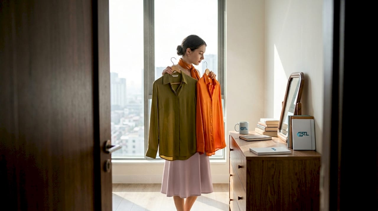
Pro tip: Adapt your color palette to the context. Muted and deep tones are suitable for a professional interview, while bright and saturated colors are better suited to an artistic or festive event.
Behind every successful color choice, there is often a method. Colorimetry applied to fashion is a discipline that allows us to identify the shades that enhance each individual based on their physical characteristics.
There theory of seasons in colorimetry It classifies profiles into four categories: spring, summer, autumn, and winter. Each season corresponds to a palette of harmonious shades that complement skin undertone, eye color, and hair color.
| Season | Skin undertone | Recommended colors |
|---|---|---|
| Spring | Warm and clear | Coral, peach, ivory, apple green |
| Summer | Cold and clear | Lavender, pearl grey, sky blue, pink |
| Fall | Warm and deep | Rust, mustard, brown, forest green |
| Winter | Cold and deep | Black, pure white, burgundy, midnight blue |
To identify your season, the draping technique is recommended. It involves placing different colored fabrics near the face and observing the effects on the complexion.
Here's how to perform a draping test effectively:
Once you've defined your color palette, you can apply it to all your fashion purchases. To learn more, discover how combine colors in mode in a creative way, or harmonizing color and art for total visual consistency.
The color wheel is another valuable tool. It organizes colors according to their relationships: complementary (opposite each other on the wheel), analogous (neighboring), or triadic (equally spaced at 120° intervals). Using these relationships in an outfit creates either a soothing harmony or a deliberate contrast that draws the eye.
Every color has a biography. It is shaped by history, culture, and the physiological reactions it triggers. Understanding these nuances helps in making more intentional and expressive choices.
According to the symbolic psychology of colors, here is how the main colors act:
“Wearing a color is sending a message before you've even said a word.”
These effects vary depending on the intensity and saturation. A pale blue doesn't evoke the same sensations as an electric blue. Similarly, a dusty rose is nothing like a fuchsia. The nuance is just as important as the hue.
| Color | Main emotion | Visual effect | Recommended use |
|---|---|---|---|
| Red | Passion, urgency | Eye-catching | Festive events, statement looks |
| Blue | Confidence, calm | Soothe | Professional environments, casual attire |
| Yellow | Joy, creativity | Rayon | Artistic looks, sunny outings |
| Green | Balance, nature | Soothes and revitalizes | Casual outfits, eco-conscious fashion |
| Violet | Mysticism, luxury | Intrigue | Evening looks, expressive fashion |
Colors can also reveal emotional states. Some stylists and psychologists observe that color choices change during periods of stress or transition. After months of gray and black, a return to yellow or green often signals a need for renewal. This is why the desire to explore your personal style can also be an invitation to expressing one's personality through clothing in a more conscious way.
Cultural variations also deserve attention. In India, yellow is sacred and brings good luck. In the West, it evokes lightheartedness or, in certain contexts, caution. In China, red is the color of happiness. These meanings influence global trends and the interpretation of international fashion collections.
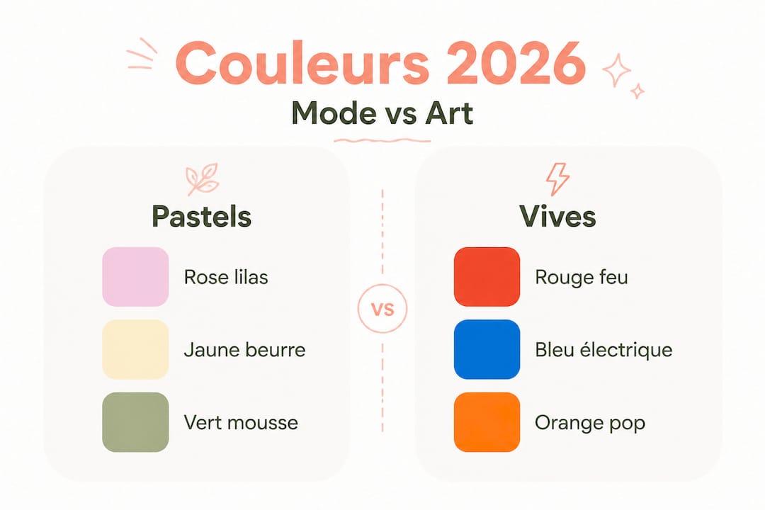
Fashion in France in 2026 revolves around two opposing but complementary poles: the softness of pastels and the strength of bright colors. Spring-Summer 2026 color trends confirm this duality with tones like lilac pink, butter yellow, cobalt blue and tomato red.
| Category | Featured colors 2026 | Example of a port |
|---|---|---|
| Pastels | Lilac pink, butter yellow, sky blue | Lightweight dresses, oversized sweaters |
| Vives | Cobalt blue, red, peach orange | Coats, accessories, sneakers |
| Neutrals | Off-white, beige, light grey | Basics, office outfits |
Generation Z strongly influences these choices. They favor purple, chartreuse green, and saturated yellow. These shades naturally lend themselves to a fashion that blends art and everyday life. As for makeup, searches for colorful looks have increased by 52.9% on Pinterest, proving that color extends far beyond clothing.
Among the major trends observed:
Art directly influences these colors. Capsule collections that collaborate with visual artists use less conventional palettes, more saturated or, conversely, highly nuanced shades. artistic accessories They allow you to incorporate this dimension without completely changing your wardrobe. trendy accessories 2026 They also offer accessible options for adopting the new color palettes.
Pro tip: Don't blindly follow color trends. First, check if the trendy shades match your personal color palette (as defined by color analysis). A beautiful cobalt blue on a "winter" complexion might look dull on an "autumn" one. The idea is to adapt the trend, not copy it.
Many people approach color in fashion as a matter of personal taste. That's a start, but it's not enough. Color affects others and yourself in a more profound way than is often imagined.
The first pitfall: trying to match everything perfectly. This approach produces outfits that are legible but lack depth. Bold color doesn't mean chaos. It involves understanding contrasts, daring to create a deliberate clash of hues, not an accidental one. There's a big difference between a poor choice of taste and a bold statement.
Second pitfall: ignoring your own emotional reactions to colors. Some shades you've avoided for years deserve a second look. According to color trends among young peopleExtroverted personalities tend towards bright colors, while introverted types prefer muted tones. But these habits can also reflect inhibitions rather than genuine preferences. A poorly chosen shade of yellow can become anxiety-inducing. An omnipresent black can signal a need for protection rather than a true desire for elegance.
A third, often overlooked point: the post-COVID context has changed young adults' relationship with color. After years of restrictions and uniformity (grey tracksuits, neutral interiors), there has been a real return to bold, almost defiant, color. It's no coincidence that vibrant hues and art-inspired looks exploded between 2022 and 2026.
Color then becomes an act. Wearing bright orange in the city is taking a stand. It's saying: I'm here, I reject the grayness, I own it. Perhaps this is the true role of color in fashion: allowing everyone to affirm something true about themselves, without needing words. Those who seek to explore art and fashion To build a unique style, one must intuitively understand this dimension.
Pro tip: Analyze your drawers. The colors you wear most often reflect your current emotional state. Those you've long avoided sometimes deserve a second chance, starting with an accessory or a secondary piece.
After exploring the science and symbolism of colors, the essential remains: finding them, wearing them, living them. EST.L Shop offers a selection of colorful clothing for women and men, designed around the artistic collections of Gary Kago, including the “Joy & Freedom” collection which plays precisely on bright and expressive palettes.

The available pieces range from t-shirts to sweatshirts, all designed as canvases for visual expression. Accessories complement these looks and allow you to add a touch of color without completely overhauling your wardrobe. Printed or original artwork is also available for those who wish to extend their color palette beyond clothing. Each piece is designed for those who want their style to truly reflect who they are.
Colors evoke deeply rooted emotions, memories, and symbolism. Depending on their emotional nuances, colors can even reflect profound emotional needs or past experiences, which explains strong and sometimes irrational reactions.
Color analysis and draping tests help identify your ideal color palette based on your skin undertone, eye color, and hair color. This method provides concrete and personalized results.
The spring-summer 2026 trends place pastels like lilac pink and butter yellow, bright colors like cobalt blue and tomato red, as well as neutrals like off-white and natural beige, at the forefront.
In fashion, color dresses the individual and codes their social image. In art, it serves to convey an emotion, a message, or an atmosphere, regardless of the function of the medium.
Use the color wheel and custom palettes to create cohesive harmonies. Then adjust the color intensity according to the context and your style to achieve a balanced and expressive result.


